Sunday, November 25, 2012

New Animal Sketches


I've been working on a sketch series for a new Royal Brush project.  These are some of the finished images for an "Animal Safari Adventure" Sketch & Learn book.  I really like the idea of combining interesting animal facts with the sketches and outlines.  


I've been learning a lot by drawing a variety of animals.  I've discovered you don't have to include every bit of detail, but rather strike a balance of giving just enough information to "read" a feature.  For example, I did not include every spot on the cheetah, but rather gave the impression of spots.  And I don't even attempt to draw every hair, but just enough to look like fur.  Detail and sharpness around the eyes is especially importance as that is typically the focal point with animals.  


Palomino Colored Pencils

This is a quick study using the brand Palomino Colored Pencils.  I love the Palomino graphite pencils and just had to give the colored ones a try.  They only come in a total of 24 colors, but since I tend to use a limited palette, these are plenty.  I am pleased with the color intensity as well as the quality.  No crumbling, no breakage of the lead.  These are available for purchase at www.pencils.com

Thursday, November 01, 2012

Artwork Featured in New Drawing Book


I have just received a copy of a new book called Drawing & Sketching Secrets that features several of my drawings.  The book was written by Donna Krizek.  It is an honor to have my artwork in the same book as other very talented artists such as Karen Hargett, Mike Sibley, Terry Miller, David Te, David Poxon to name just a few.   

Here is a direct link to Amazon to purchase this book (ISBN 978-1-60652-489-3).  
(Note: The cover image is incorrect on the link, but this is the same book.


Monday, October 08, 2012

Article Two - It All Starts with a Mark

Repost from http://pencils.com/blog/it-all-starts-with-a-mark/


The anticipation of making that first mark on a blank sheet of paper for me is exciting.  Each mark builds upon the last one and soon the image begins to evolve and appear on the paper.

As with any art medium, knowing what your graphite pencil can do is important.  The simple pencil can make a variety of different textures and effects just with a little practice.

Smooth Gradient
Creating a smooth tone from dark to light.  Practice creating a smooth gradient by using heavier to lighter pencil pressure in one pass.  Notice the difference between using a harder lead versus a softer lead. The softer lead creates a darker more grainy tone.

 Gray Scales  
Use the full-range of pencils available (6B – 2H) to match the value.  You can vary your pencil pressure and/or use multiple pencil grades to create the value.  Be sure to note which pencil(s) were used for future reference.
Pencil Marks
Varying the pencil mark can create a multitude of different effects. Combining different pencil marks in one sketch, will create variety, and more realistic images.
  • Circular – Draw small circular strokes using a light pressure.  Use multiple layers to create a smooth, even and diffuse tone.   Particularly effective for skin textures.

  • Cross hatching – Draw close parallel lines.  Change the rotation of the lines with each layer.  This works well for large areas and creates a smooth, ‘linen’ effect.

    Scribbling – Using the over-hand pencil grip, create small random scribbles.  This is very effective in creating foliage on trees.
  • Random marks – This is similar to scribbling, except the marks are random.  Varying the pressure of the pencil can build up areas quickly.  This is a great technique when exploring subject matter and quick sketching.


Erasing
Erasing can be as important of a tool as the pencil.  By removing or lifting off graphite from your sketch, you not only remove mistakes, but can also create different effects and subtle values.
  • Kneadable eraser – This eraser can be molded into shapes and lift graphite off the paper.  To clean the eraser, just knead until the graphite is absorbed into the eraser.
TIP: Remove graphite from your sketch. As long as the graphite has not been marred into the tooth of the paper, you can actually remove all graphite from your sketch by using a “press and lift” approach. Practice this technique and you will never have to worry about making a mistake or going too dark again!


  • White Mars eraser – I use this eraser sparingly.  Most common use is to erase using a ruler to create sharp edges. I keep a sharp edge on the eraser by slicing at an angle with a knife.


TIP:  DO NOT USE the white eraser on dark areas.  This will smudge the graphite and push the graphite into the fibers of the paper, making it difficult or impossible to remove.  INSTEAD, use the kneadable eraser to lift the graphite off the paper first, then finish with the white eraser.


Blending
Blending pushes the graphite into the fibers of the paper and removes the “graininess” of graphite layers.  This creates a very smooth, soft affect that is commonly used to create clouds in landscapes and smooth skin in portraits.
  • Blending Stump – The stump made from pressed paper.  This is used to blend small, detail areas on your sketch.
  • Chamois – The chamois is a soft material that you wrap around your index finger, then using a circular motion, rub to blend the graphite layers to a smooth finish.  This works well for larger areas such as creating skies in landscapes, or backgrounds.

Burnishing
Burnishing is a technique of applying a harder lead (3H) with the flat part of a chisel point over a detailed area.

  • Blending versus Burnishing – The purpose of both blending and burnishing is to create a unified even value over a specific area but each will create much different results.  Blending will blur or lessen your detailed areas, creating a softer look. Burnishing will retain all the under lying detail while creating a light unified tone.  Burnishing will create a more realistic image than blending.


Q and A  – Each article will be posted on Diane’s blog at www.dwrightart.blogspot.com.  Comments or questions can be posted there and Diane will respond to any questions or discussions


Sunday, September 30, 2012

Fall Colors 2012


Due to our early spring and super-dry summer, fall has come early this year.  Today was a beautiful day to enjoy the explosion of colors.  Ledges State Park was recently re-opened after the floods of 2008, so we decided to check it out.  Lots of folks were enjoying the mild weather and the beautiful fall colors.  Yup, this is proof that Iowa is more than just corn fields.


One of my personal favorites.  My husband is peeking out behind the tree.  Love it!


Ledges is known for is soft sandstone bluffs.  The trees grow on top of the rocky formations.


We seldom see these brilliant oranges and deep reds.....


 One the way home, I caught a couple of scenes with the brilliant yellows.  The dark reds are sumac.


Sunday, September 23, 2012

Grand Canyon

I love vacations.  They don't come often enough.  After spending several weeks of working overtime at the day-job, having a few days off can rejuvenate the soul.  We enjoy going to Las Vegas as there is always something to do (without even gambling).

This visit, we added a day trip to the Grand Canyon.  The beauty of the canyon is so spectacular, words cannot describe it and photos can't capture the sheer vastness of the vistas.  But here are a few of my best attempts...(click on the image to enlarge)


Tuesday, September 04, 2012

Article One - Pencil Basics

Repost from http://pencils.com/blog/pencil-basics-with-diane-wright/

Greetings Studio 602ers! Over the next few weeks, Pencils.com featured artist Diane Wright will be sharing several articles that cover the basics of creating art with a pencil . If you aren’t familiar with Diane or her work, check out this interview featuring the Queen of Landscape Pencil Art herself and, without further ado, let’s get started!


 A Passion for Drawing

I am frequently asked, “Why drawing?” Pencil art is one of the most direct and expressive art forms. It is also the most simple, requiring just a piece of paper and pencil. The pencil is an extension of the hand and the flow of ideas onto the paper becomes seamless.

The process of drawing can help us explore our ideas and capture the wealth of detail from the world around us. Our creations can be as simple as a partial sketch or as complex as a finished piece of art. It’s amazing what can be expressed with just a pencil.
Over the next few weeks, we are going to discuss the some of the basics of drawing to help you get started.
Let’s start with the basics….

Pencil lead hardness – Pencil hardness ranges from 9H to 9B, with 9H being the hardest and 9B the softest. Their characteristics differ in that the H’s create a lighter mark that produces a light silver color while the B’s are softer, creating a darker and blacker mark. Do you really need all of them? It is nice to have the full range, as each one is subtly different, but as you work 2 or 3 will become your favorites.

Pencil point – The point on you pencil has a large effect on the type of pencil mark you will produce.

A sharp point is used to make fine lines and work in small detail areas.A blunt or rounded tip will produce less refined marks and is good for shading. The chisel point is the most versatile. The flat side is good for shading and the edge can be used for creating detail or fine lines.
Pencil grip – How you hold your pencil can affect your pencil strokes.

The writing grip (the one that you use to write with) is good when working in detail areas. It creates a very deliberate stroke and precise details. If your marks are too tight, you are probably holding the pencil too tight.
The underhand grip creates a smooth, flowing stroke. Hold your palm above and almost parallel to the drawing surface with the pencil running under and across the palm. (I rest the butt of the pencil on my little finger.) Keeping your wrist stiff, use your entire arm to make the stroke. This allows a more fluid motion resulting in a fluid mark. With a little practice, this grip becomes very comfortable and natural.

Pencil pressure – This is simple: the harder you press down on the paper with the pencil, the stronger and darker the mark and the lighter the pressure, the lighter the mark. As I explore a subject, I will use more pressure when I am drawing the shadow and use lighter pressure when working in the highlights. I feel those lights and darks with the amount of pressure I apply to my pencil. This creates very expressive lines and in turn, brings life to your mark.
Paper – Choosing the right paper is important; your efforts are worth using good quality paper. My preference is Bristol board smooth drawing paper (two great brands include Strathmore 300 Series Bristol board smooth and Canson Foundation). For portraits, I prefer Arches or Fabriano hot press watercolor paper.
Questions? – Each article will be posted on Diane’s blog. Comments or questions can be posted here at Studio 602 or on Diane’s blog, where Diane can respond directly.

Next Article: It all starts with a mark

Wednesday, June 06, 2012

Merging - Organizing - New Page Tabs

When I first started this blog, it was a place to share my art journey with friends and fellow artists. Over the past few years, my writings have evolved into numerous articles about drawing tips and techniques that were posted in a second blog dwrightsketches.blogspot.com.

The time has come to consolidate and organize my works in progress, articles and tips/techniques into one central spot. As my first step, I merged an number of posts from the other blog into this one.
After todays released publication of these articles, look for updates on a new Page Tab that will feature a Table of Contents organizing article links by topic.

I hope you take this opportunity to revisit some of my work and musings in the republishing of these posts. I plan on expanding drawing topics and continuing to add new articles ranging from drawing basics to more advanced artistic techniques.

I look forward to your comments and contributions.

Diane

The Why Factor

Original Post: 11/13/2010

The Why Factor – Motivation, Inspiration and Direction

The artist's journey

Before anything is ever put on paper, our artwork is born from an idea or thought. This may be something that suddenly springs into our mind, or it could lie dormant or brooding for years just under the radar - culminating, transforming and perhaps emerging once it finds an avenue or our skill/mindset is ready.

Sometimes we don't have an answer, but we should try to have some meaning to our creative endeavors. Understanding where we are, where we want to go and how we are going to get there gives us purpose and direction. When we find ourselves losing interest or wandering we should re-evaluate our artistic path, re-adjust and regroup. This is evident when we see artist's using themes, various mediums or periods of realism/abstraction. Their artwork seems to follow a path or evolve....this is the evolution of an artist's journey.

The artwork

Each individual piece of artwork should also have a purpose. Mike Sibley uses the term “the Why factor” in his book "Drawing from Line to Life" .  He continues by asking the reader "Why are you about to begin this drawing? ...What are you going to say?"

All too often we hear an artist give a brush-off excuse of “it's just a commission” or “I like the picture”. We should challenge ourselves to so much more! Even if it is a commission, you can still push it to “SAY SOMETHING”.

If you don't take the time to understand the motivation behind your drawing, you are in danger of creating a lifeless, photocopy of an image.

So here are some questions to ask...

What is motivating me to draw this?

Is it following my overall goal?

Or is it a sideline or different path that I want to follow? (that's okay too)

What do I want to say?

How do I want to say it?

What do I want to emphasize, exaggerate, express?

What approach do I want to take?  i.e. bold, subtle, realistic, dramatic, abstract.

What composition layout will best tell my story?

How do you approach your creative process?  What do you ask yourself?  Have you even thought of this?  Where are you on your journey?

If you are interested in joining Mike and others in conversational topics such as this come join the Yahoo group:   http://groups.yahoo.com/group/DrawingLinetoLife/

Diane

The Importance of Sketching

Original Post: 9/26/2010
When I'm not working on a 'full-sized' drawing, I am sketching.    Sketching provides the opportunity to
  •  explore your subject matter and medium
  •  exercise and stretch your skills
  •  test out new techniques
  •  explore textures, compositions, lighting effects
Sometimes sketches are indeciferable to any one but the artist, nothing more than scribbles.  Other times, they can become a finished artwork.  But most of the time, sketches are just snippets of thoughts or an impression of an idea. 
For an artist, sketching is the most uninhibited and free-est expressive moment possible.  Sketching is an artform in itself and give the viewer insight into the soul of the artist.
 

Shaded Darkness

Original Post: 1/11/2011

I've been working on adding mood to my sketches.  This is a sketch capturing the mood of shady darkness under a tree - respite from the stark sunshine.  The composition is playing with contrast of sharp and diffused edges and placement of sky holes.    There are impression of roots amongst the textured grass by bold lines.   
Sketches can release artistic freedom to self expression and experimentation.  Sometimes they hold the key to unlock creative avenues and glimpses of future possibilities.   This sketch is bold in many ways that is new and exciting.  The energy needs to be harnessed and nurtured. 

Sketches

Original Post: 11/24/2010

Here are a series of sketches created over the past few weeks. Some of these may be the start of an idea for a full-sized drawing, some are working out composition, some are just practicing and some are working out textures.

Enjoy!

Diane


Using Reference Photos

Original Post 11/13/2010

Here are my responses to questions regarding the use of reference photos.

How do you use reference photos?
  • Inspiration?

  • to work out a story or idea?

  • to identify technical accuracy of an object?
Yes, yes and yes.  I have thousands of photos that I have taken myself, photos taken by others and photos downloaded from the internet.  I use them for inspiration ALOT!  
Recently, my son hiked and took lots of photos of Yosemite.  I have researched the area on the internet and while I might personally haven't visited the area, I feel like I've walked those trails.  Can I make believable drawings of places I have never been to?  Well, I think I can. 
By drawing upon experiences of places I have visited and researching and understanding the terrain of the area, there is no reason why I can't produce just as dynamic and believable scene. 
Now there is nothing that beats first hand experience, but in my situation, photos are an acceptable alternative.  And I've been able to experience visiting beautiful landscapes through my pencil.

Has your use of photos changed over the years? Explain.
Absolutely.  I was a slave to photos when I first started.  If it wasn't in the photo, it didn't exist.  If the angle was skewed in the photo, the angle was skewed in my drawing.  This is an inherent flaw to using photos and when possible....to be avoided.

I'm now weening myself away from the dependency of photos being "the absolute".  With deliberate and conscious decisions, I'm deviating from them.  (With a mixture of good results and horrible results - but creative freedom none the less.)

“Reference and imagination are partners. It's important not be a slave to either.” Robert Genn
I really like Robert Genn's phrase.  Here is my take on it.  "Too much reference and the work is lifeless, too much imagination and the work is lifeless.  A healthy combination of both....creates a work of art."

ArtgraphicA - Online Tutorial Resource

Original Post: 11/13/2010

Gavin has updated his website and is a resource for some of the best on-line tutorials available.  http://www.artgraphica.net/.  


He also has posted in full HTML format, one of my all time favorite classic books on trees Artistic Anatomy of Trees by Rex Vicat Cole along with other classics.


Take some time to visit his site....well worth the visit.


Chisel Point

Original Post: 10/14/2010

The most versatile pencil point is the chisel point. The top sharp edge can be used for finer markings, details and creating fine lines. The flat angled plane can be used for shading.

To easily create the chisel point:

a) sharpen the pencil
b) hold the pencil at an angle
c) lightly scrub the tip on fine sandpaper

Fern Sketch - Negative Drawing

Original Post: 7/31/2010

Ferns. I love them, they are rich in texture and would be a great addition to wooded scenes. They've been elluding my pencil though. In Mike's book "Drawing From Line to Life", he suggests disengaging the subject by drawing the space around it, or what is called negative drawing.

So I ignored the leaves, focused on the dark spaces between the leaves. I also did not outline anything, again the focus on only tonal shapes "between the leaves".

This is so exciting!!!! Ferns appeared for the first time on my paper! Very fresh, spontaneous and organic.

Here is the small incomplete sketch, but expresses a major milestone....one step closer to the negative world.


Sketchbooks

Original Post: 7/25/2010

What's your favorite sketchbook? Bound, spiral, hand made, hybrid?
 
I guess mine is a hybrid. I have tried hard bound, spiral, moleskins. The biggest problems I have with any of them is the paper quality. So I've created my own using Rollabind (see attached image of my sketchbooks.)
 
There are a number of advantages.

  • They lay flat.
  • I can interchange any kind of paper, writing, smooth, rough, watercolor paper.
  • I can remove a page, scan it, and put it back in.
  • I can archive them to another book. I can add my writings and sketches together in the same book.
  • The rollabinds keep the paper snug so there is little smearing like the spirals cause.


What is the size of your sketchbook?
I have two now...5x7 and 9x11 (holds 8-1/2 x 11" paper)

 
What's your favorite pencil/pen you use when sketching?

 
2B .5 mm mechanical pencil

 
Do you carry a sketchbook with you all the time?

 
Depends on what I'm working on. If I'm trying out an idea or technique, I'll carry it otherwise I can go weeks without carrying one.

 
Do you have a mobile sketch kit? What's included?

 
I've got one that I made about 3 years ago. The moleskin is about 1/2 full. When I feel like dabbling in color, I get it out. Then I remember how bad I am at color and it gets tucked away again!
http://dwrightsketches.blogspot.com/2007/07/sketch-journal.html

 
How often do you sketch? Daily, weekly, never?

 
A couple times a week. Usually when I'm too tired to focus on my drawing, I'll doodle or sketch.

 
Why do you sketch?

 
Work out ideas, techniques, compositions.

 
What do you put in your sketchbook?

 
Sketches of landscapes, rocks, parts of trees, notes about topics for this group, ideas, shopping lists, scribbles and ramblings....

 
Do you keep your sketchbooks?

 
I keep the best ones. The rest are pitched.

 
Do you keep doodles in your sketchbooks?

 
Way too many doodles!! But they seem to clear the wandering mind.

 
Do you ever throw away or erase sketches?

 
Yes....garbage gets full of them....

 
How about some scans of sketchbook work?

 
My sketchblog is full of them...

Gesture Drawing

Original Post: 6/12/2010

When I took life drawing class back in college, gesture drawing was used as a warm up exercise. That's a pretty short-sited approach to take. The definition of gesture drawing is to capture the energy and movement of the subject matter - or to capture the essence of the pose. While gesture drawing is typically used in figure drawing, I see no reason why I can't use the same approach with still lifes or landscapes.

I've been reading Walt Stanchfield' s book "Drawn to Life". He must have been a very enthusiastic and vibrant individual because it really comes across in his writings and his drawings. Here are a few gesture drawing tips I've gleamed from his book:

1. Use a fountain or pen & ink. Use cheap paper so you have no hesitancy to do lots of renderings.

2. Exaggerate the pose. if the body is leaning over, lean it "more". This creates more drama and 'essence' of the pose.

3. Try the pose yourself. Feel the shift of the shoulders, the weight on one leg, the position of the hips, the stretch of an arm. This will help you "feel" the pose and understand what the muscles are doing.

4. Always include the hands and feet in the gesture drawing. They are the most expressive parts!

5. Work to capture the weight of the body. (If the head is leaning against a hand, make sure the "weight" of the head is apparent in the hand. The position of the arm to head is important.)

6. Action, reaction. Squash and stretch. If the body is bent over, the back stretches and the stomach squashes. If the leg bends, the front of the knee stretches and the back of the knee squashes. In every movement there is an action/reaction.

5. Clothes will react in a like manner (squash and stretch) and will enhance the gesture. Manipulation of the wrinkles, lumps, bulges, folds, seams will enhance the gesture. "A real solid, expressive, sparkly drawing in one where the clothing is doing what the body is causing it to do."

7. A pose is always doing an action, even sitting.

8. Avoid tangents. (Lines meeting at the same point. It's the death to depth. (I'll address this later with examples)

9. Draw with verbs not nouns. Add adverbs for drama. (Example: Don't just draw the body part...arm, elbow, hair. Instead portray a woman "bending" over, "stretching" her arms to dry her "wet" hair.)

10. Gesture drawing will solidify your understanding of the pose. You can work out the pose, modify, elaborate, change it to 'tell' your story more effectively. Better planning before you start your portrait.


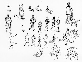
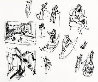
Gesture drawings can range from capturing the mass of the figure, to contours, to simple stick figures. The purpose is to capture the essence of the pose.

You can see in my drawings that I've repeated a pose several times. They go from fairly detailed gestures to simple stick figures. Each one trying to understand the pose.

So how can gesture drawing help you draw realistically?

Just think of the powerful impact of understanding anatomy and applying creative energy/essence of gesture drawing on your drawings. Your portraits will come 'alive' on the paper!

Drawing the Figure

Original Post: 5/31/2010

The human figure is a complex form, combining skeletal and muscular components. By breaking the components down into simple geometrical shapes, it's easier to capture the general form. Arms and legs are cyclinders, the elbows, shoulders and knees spheres, the area between the shoulders are a triangle.

Drawing through the form helps to identify the 3-dimensionality of the body part.
The ideal figure proportion is approximately 8 heads tall. Balance, symetry, flow and movement should all be considered.

These sketches are studies derived from Robert Barrett's book "Life Drawing".

Drawing Hands

Original Post: 5/16/2010


Andrew Loomis is my instructor this morning. I've attached a couple of pages of sketches working through his illustrations.

Hands are not as intimidating as they look once you understand the basics. The hand is two units in length with the center being just above the knuckles. An arch or curved arrangement of the fingers and knuckles are key. (A common mistake is to draw the knuckles in a straight line.)

The palm of the hand is all pads with the center of the palm hollow. The back of the hand is all tendons.

I hope you all have a chance to practice!!! Everyday that I freehand sketch gets a little easier. Using guides of measurement and using basic shapes to block in an object is helpful. Once I get the proportions correct, then I start to work in the details.


Drawing the Head

Original Post: 4/18/2010


How do we put all these features - the eyes, nose, mouth, ears, hair, cheeks, chin, eyebrows, each so uniquely different - into a harmonious and unified "HEAD"?


Thank goodness the head can be reduced into general proportions to help us guide the placement of the features. I've attached a simplistic diagram to outline these guidelines.


Drawing the head at various angles adds interest to our composition. It also adds complexity as well. Understanding how to apply perspective can help you immensely in getting the head to look correctly.

Giovanni Civardi's "The Art of Drawing Portraits" has some very good exercises to try. I have attached my first attempts at drawing the head in various angles using his illustrations.

I cannot stress enough how important it is to actually put your pencil to paper and try these exercises! It is one thing to read and visually understand the concepts. By taking the time to practice brings a whole new level of understanding and solidifies these principles.

I've been wanting to get to this portion of our studies for a long time as the head/body have illuded me long enough! I have a very personal goal in mind and these are only the first of many tries and studies that I want to explore. My goal is to learn how to effectively draw the figure so I can start including them in my drawings and add urban landscapes to my collections.