Sunday, December 31, 2006

Happy New Year!

It has been a great year and I am really looking forward to what the new year has in store for me! It is New Year's Eve... my son is home from Houston, Tx and has a number of his friends over celebrating.

And I'm cloistered in my studio drawing......rocks. Yup that's right. I am doing a rock study for a rock tutorial. Thought I would share! I have the rocks completed, now just have to finish the ripples in the water, and some grass and leaves.


Wednesday, December 13, 2006

Polk City Barn II - Commission

I believe I've got it finished. The textures are rich in this cluster of farm buildings which make this an interesting drawing. The overall tones are darker than many of my previous drawings. This is something that I am working on to build richer, darker tones....


I'm cutting this close. I am trying my hardest to get this done before Christmas. Here's an update!


I continue to work on the buildings. The brick building has been challenging as I create brick textures while not attempting to draw each brick meticulously. I used a 4H chisel point clutch pencil to give an overall tone to the buidling and then using a softer lead (2B) I create areas of brick details.


The tree is starting to emerge on the paper. I want the tree to feel like it is engulfing the building as the branches stretch themselves over the grainery shed.


I have continued to work on the tree as it branches out behind and over the front of the building. This is the most interesting part as the shadows dance over the building that is tucked inside the branches. I am using a 4B and 2B .5 mech pencils to get these rich darks. The highlights are lifted out using the blu-tack.


The detail of the tree foliage is built up with multiple layers of graphite. I use a scribble pencil stroke to create the leaves. Using a battery eraser, I restore the lighter branches and then darken the edges "underneath them".

I will continue to 'built' and 'erase' the leaf bundles to create depth, texture and values of the leaf bundles. The branch is drawn around (negative drawing) leaving it white. I will come back to it later to create more form.


I have created the outline of the buildings and have shaded in the sky tone. This 'toning' of the sky will allow a broader range of values to be captured in this drawing.


This is a return to a previous commissioned subject matter I did for a good friend of mine. She was thrilled with the rendering I was able to produce. The first commission was a challenge since I had to use 5 different photos and piece together the image. You can see the first drawing at: http://www.dianewrightfineart.com/commission.htm - called Polk City Barn.


Since then, she discovered another photo of the barn with additional outbuildings. This one is no less challenging as the photo had 2 vehicles and 2 kids in the foreground.


With the help of Photoshop and a piece of my previous drawing, I was able to piece this composition together. Here is the original photo and the Photoshop enhanced image that I will be using for this drawing:


Tuesday, November 21, 2006

Evening Shadows


Here is a quick study (less than an hour) on clouds in the early evening just as the sun is thinking about setting. The clouds are backlit by the sun and are darker than the sky. The trees are mostly in shadow and most of the details are subdued. This is a small drawing only 4.5" x 7"


Thursday, November 16, 2006

Book Cover!


I just had to share with you all! Here is the cover of my book!!! ENJOY!


Diane

Sunday, November 12, 2006

My Mind is in the Clouds

Step 6 - I worked a bit more on the cloud heads and created a bit more unity. Then it was onto the landscape. I deviated a bit from the actual reference photo, attempting to make a compositionally balanced view. It is acceptable for a first attempt as such a drawing and there will be more studies in future that will explore the rolling hills of Iowa.

Enjoy!

Step 5: I have completed the clouds and will start working on the landscape. In-between corn fields Iowa has some beautiful rolling hills and valleys.


Step 4: This is where the fun starts. Erasing highlights and adding shadows, 'sculpt' the clouds. I switch to a 2H .5 mech pencil and a tortillion.


Step 3: Using erasers, I start lifting the clouds out of the toned sky. Each eraser will create a different effect. A plastic eraser will lift off nice blocks of graphite, a pencil eraser will lift fine lines and blu-tak will lift soft wispy areas.


Step 2: Using a chamois, I blend the graphite smooth. You can see how messy I get on the borders. That's okay because I want the graphite to smooth out to the very edges of the drawing.


Step 1: Use a loose-hold on your pencil. Hold the pencil 1/2 back on the barrel and let the weight of the pencil create the stroke. The purpose of this is to create an even light stroke. Using multiple layers of cross-hatching, I build up the layers of graphite. I am using a B .5 mech. pencil for crosshatching.


Ever since fellow artist MLeonard, member of Artpapa, challenged me to include a sky in the Ivy Church drawing, I have been keeping my mind in the clouds. I am continually amazed at the beauty of just looking up in the sky! Over the past couple of years, I have been learning the importance of toning the sky and adding clouds as part of overall compositional improvement in my landscapes. The emphasis in this panoramic landscape is the clouds. I think I could spend hours and hours fiddling with each puff of white!

Saturday, November 11, 2006

Zach - GoKart

Opps...We are missing a trophy! Thank goodness I had just enough room left on the paper to add this award!

Final - With completing the helmet and blending the area around the helmet and car, I believe this drawing is completed!


Wip 5 - I got up bright and early this morning to jump right into drawing again. Got a cup of coffee and I'm good to go! The car and trophy are now completed. When working in dark areas, black is never just black. Instead I concentrate on finding the subtle forms within those dark areas. They may eventually look black but if look closely the form can still be defined. This is a key technique in creating 3 dimensionality. A good example of this is the tires and tire wall areas. I have included a close-up of the go-kart as well.


Wip 4 - I'm starting to work on the go-kart...


Wip 3 - Finished the suit and started on the trophy. I am blending the three images together with a blended method. I apply graphite, blend it with a tortillion, then use a plastic eraser to smear and erase a texture into the areas. By doing this the three separate objects become unified together. I still need to work in some of the details into the trophy but it's starting to emerge on the paper.


Wip 2 - Moving right along, I finished the hair and have started on the suit.


Wip 1 - I have started on Zack's face. Using a B .5 mechanical pencil I lay down the shadows and darker areas, then chamois smooth. I then start lifting and shaping the facial features with blu-tak and more layers of graphite. I still need to work on his hair and ears, but I think I have his likeness down.


This is a commission that I am doing of a young man who won 3 national go-kart championships this past year. What proud parents he must have! Here is a general compositional mock-up of the drawing layout.


My Artist Daughter

Had to sneak this photo into my blog. My daughter, Becky, is a Junior at Grandview College. Her major is Art. After looking at this picture, I have no doubt why she changed her major. I am very proud of her and her accomplishments. And I just wanted to share with the world, my daughter's painting.....

BTW - Currently we have six cats co-habitating with us, so one of them HAD to show up in the photo. This is Becky's kitty - Toro.


Saturday, October 28, 2006

Ashley's Grandparents

Finished!

Wip 6: Getting closer to completion! I have finished the wedding couple insert. I decided to fade part of the wedding cake into the background.


Wip 5: Here's another update. I've started to work on the wedding couple insert and will continue to fade the two images together. Looks like I need to lighten the area around the eyes on the young lady...


Wip 4: I've completed the main portraits of the couple with possibly a few modifications left to do. But will leave them for now and will start on their wedding portrait insert.


Wip 3: I've started to work on grandma, working in the same style and technique as grandpa but with a lighter hand as her complexion is much lighter.


WIP 2: I have adjusted several areas that were off a bit and for the most part I have completed grandpa. I could probably continue to fiddle, but in fear of overworking areas, I am going to move on. I may have some additional adjusting as I go along.


WIP 1: Here is my newest commission that I am working on. This one is for Ashley, a dear friend of our family! This is of her grandparents.


I have created a montage of 3 separarate photos. One of the couple as they are today, one of their wedding portrait and a photo of a bible. Here is the reference photo:

I start the drawing with a light outline of the facial features. I use these as guidelines as I build the drawing.

I start with a F .5mm mechanical pencil and draw in the eyes. I build up the facial features with a loose random pencil stroke. I then use a 4H chisel point clutch pencil to burnish in an even tone over the shaded areas. I lightly touch areas with my blu-tack eraser to pull highlights out.

Here is where I am right now. As I draw, I am continually looking at the reference photo. I see I have some adjusting of the glasses and the mouth needs a little adjusting as well.

I'll keep you posted as I continue.

Friday, October 27, 2006

Book in Editing Phase

It's been two months since my last post! Where has the summer gone? Last week I completed my drawings and manuscripts for the Walter Foster book project and it is now in the capable hands of my editor, Meghan. She indicated I should be seeing a draft by the middle of November.

It is still on schedule for publication release in June 2007. So everything is progressing on schedule!!

So what's on my drawing board now? I've got some interesting commissions that I've had on hold for the past few months. I'll be sharing them with you as I get them rolling!

Diane

Thursday, August 17, 2006

Book Update!

Here's the latest update.....I am now 2/3 of the way completed with the projects for the book! Just 6 more projects to go! I'm excited about this book and am discovering what I have to offer to others!

I've started planning workshop ideas and looking into book signing events. All new territory for me. I've even planned an artist of the month display in a local Barnes & Noble book store for the month of January.

Diane

Thursday, July 13, 2006

Walter Foster Book in the Making

Just a quick note, to let you know that I am progressing with the writing and illustrating of my new book! I've submitted the first 20 pages to Walter Foster Publishing and everything is on schedule!!


This is turning out to be an incredible learning experience for me. I am enjoying every aspect of this endeavor including deciding content, drawing, writing the manuscripts and even the tough schedule deadlines. All of the illustrations are being drawn specifically for this book, and the techniques/approaches explained are unique to my style.


I'm really excited about the content of the book and the support of the excellent editors/staff at Walter Foster (thanks Meghan!!). It's a great team effort and we are working diligently to make this the best landscape drawing instruction book!


I'll keep you all posted!!!

Diane

Monday, June 12, 2006

Dalton Barn, Virginia

Happy Anniversary Steve & Carolyn!!!

I had the pleasure of being commissioned to do a very special drawing. My brother-in-law commissioned me to do a drawing of their beautiful Virginia barn as a wedding anniversary present for my sister! What a beautiful gift!!!

I thoroughly enjoyed creating this artwork and it will soon be available for sale in a limited edition print on my website.


Monday, May 15, 2006

News News News!!!

I have the most exciting NEWS!!

I have just contracted with Walter Foster Publishing Company to author an art instruction book! It will be called "Drawing Made Easy: Creating Landscapes". It is the 7th in a series. The next few months will be very busy as I work on writing and drawing artwork for this incredible project! I will keep you all posted on my progress.

Publication release is scheduled for June, 2007.

Diane

Tuesday, March 28, 2006

A Barn Raising Experience

This is the title of the class I will be conducting in an upcoming class on WetCanvas. This drawing is the finished product that will be the subject of our class. UPDATE ON CLASS: Due to my book project, I had to regretfully delay this class until this fall. See you then!

Thursday, February 16, 2006

1900 Barn - Living History Farms

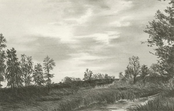
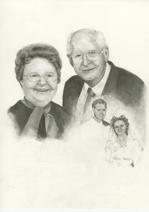
I've been working this morning on finishing this piece. As always it will sit for a week and see if anything else demands more or changes needed.

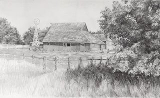
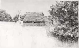
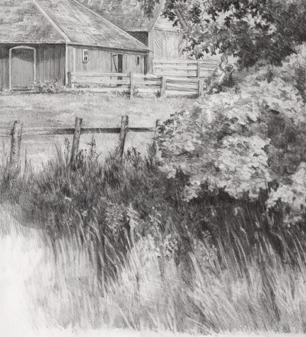
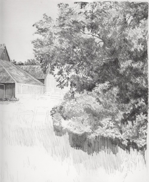
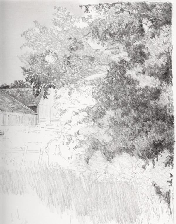
The weeds in the front were a real dilema. I didn't want a 'front wall' of weeds and the fence was also a dominant horizontal block in this composition. I spent this week contemplating just how I was going to tackle the weeds but also trying to figure out how I should handle these two dominant elements. I decided to pull the fence line slightly down with a slight bow to it. This broke up the horizontal block and I also added a bit more 'character' to the poles than what is in the reference photo. Last night, I figured out a solution to the wall of weeds. I made a slight valley where the fence bowed. This did two things...it broke up that imposing wall but it also gave the viewer a 'way into' the scene.

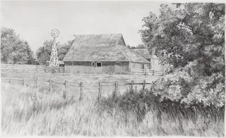
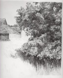
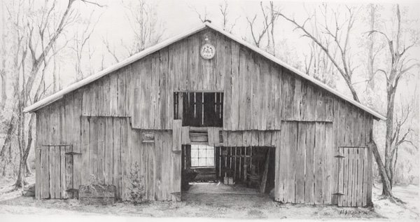
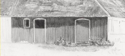
I hope you've enjoyed this journey with me! What had appeared to become a very plain barn drawing became a very pleasing 'painting' albeit in b&w.
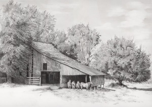
I'm slowly progressing through this landscape.... I've got the lower left corner yet to do. I've been working on the fence post. It is a bit strange that the fence only has one set of boards on it. Don't know if they have a wire in the middle to prevent the horses from getting out.

I've at least got the rest of the weeds blocked in now and need to detail in the weeds in the lower left half. 
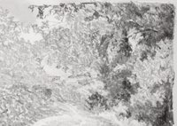
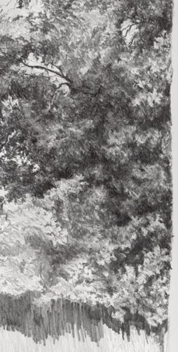
3/4/06 Well it is the weekend and I'm back at it again! Weeds are always a challenge and these have proved to be no exception!! I wish they would just get easier to draw. But I think I've got the shadowed area under the tree and the weeds surround the tree finally wrestled down on the paper. Here is a close-up of the weeds.....I've been using a 2H clutch pencil over B .5 mech pencil in this section. Using lots of blu-tak and electric eraser building and removing layers of grass.


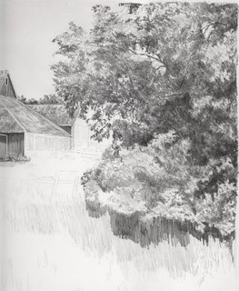
Here is another small update. I finished the barn on the sunny side and have started laying in the grass around the barn.

Thought I would scan all the sections and merge so you can see the whole drawing instead of just the sections.

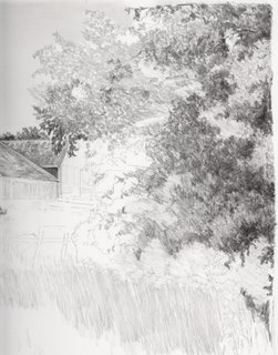
Here is one more update for the evening. I continued to work the 2B in the shadows and 3H in the lighter areas creating impressions of leaves. I have now completed the tree and will start working on the weeds and shadows surrounding the tree.....

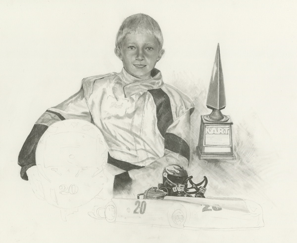
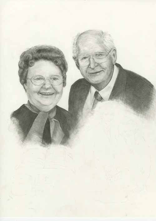
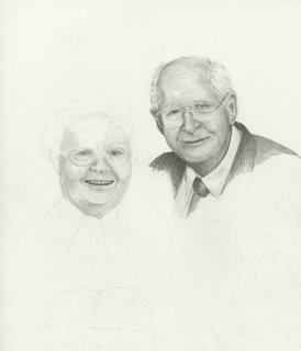
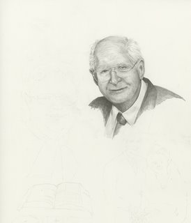
I have been requested to provide even more descriptive detail....I will try and comply. Sometimes it is difficult to stop and scan when I'm drawing!

Here is a minor update, but I wanted to show the next step as I'm moving along. I am using a 2B and 3H .5 mechanical pencil and working in some detail. I am using the 2B in the shadows to deepen areas and I am using the 3H in the highlight areas to develop those lighter shades of gray. I am using Blu-tack and pulling in some of those medium shades of gray.

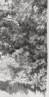
Things to observe as you are drawing trees. If you look at the small openings in the tree where the sky is seen, the tree branches are very detailed and very dark in shadow. These areas are important to capture as they are critical 'clues' that tell the viewer that this is a tree. I do not ever draw a single leaf....rather I give impressions of leaves by the shapes and highlights that I use.

Another thing to observe is the greatest contrasts are seen where the highlighted leaves are right next to the darkest shadows. These are important points to give the tree contrast and depth.

Always know where your light source is coming from. Consistent application of the shadows will make the tree more 'believable'. Hope these are helpful tidbits.....
Continuing to work on the tree.... Getting closer to have the darkest areas mapped out. I'm working hard to keep a consistent texture as I work in the dark areas. My impatience wants me to just block in the shadows but that doesn't work to develop those richer shaded areas.

I have been doing most of this work with an HB clutch pencil. However, I'm finding I am wearing down my chisel end quickly and having to resharpen frequently. It has worked well to build up the textured areas but I think I'm going to switch back to my .5 mechanical pencil to start working in the details. I'll be lightening some the darker areas up with blu-tack as I get into the nitty gritty of the leaves. (I hope....that's my game plan anyway!!!)
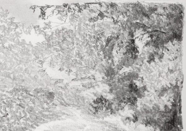
This is a small update, I am slowly building up the tree branches, working dark to light. I concentrate on the shadowed areas (negative space) as I am drawing.

I started working on the tree in the foreground. I thought I would post an preliminary layering of the tree branches so you might see how this foliage transforms itself.

I start with laying down a textured pencil stroke and block in the shaded areas. It's pretty rough right now, but thought you all might like to see the very ugly stage! I will continue to build up and erase areas to create impressions of leaves. I wish I had a firm process down to do this...but I always seem to stumble my way through it... this is the upper right corner of the foreground tree.


Finishing up on the trees in the background. I like these clutch pencils. I feel like I'm painting in B&W! I actually was standing up at my draft table while drawing the tree on the left....

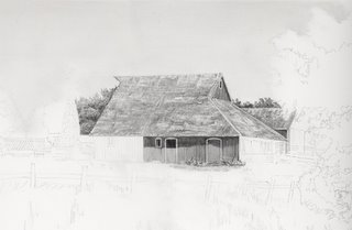
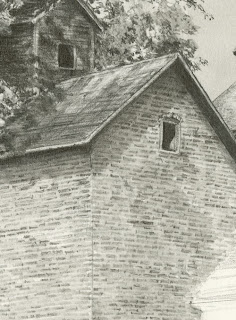
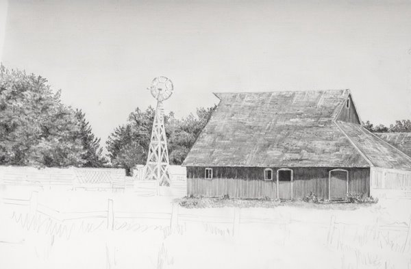
Here's the 2nd installment and have been working on the shingles and side of the barn.
I 've been using clutch pencils trying to get use to them. I am liking them more and more as I draw. Ken Brown on DrawingLinetoLife group mentioned that the "pencil lead lays down smooth and creamy". This is a perfect description of the lead. I really didn't think the lead quality would make that much difference. I was definitely wrong!

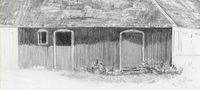
The siding of the barn is laid down with one pencil stroke. I've made a chisel end to it lead and with one stroke I have a perfect shade. I am using HB for the siding.

The highlights on the shingles are done by touching my electric eraser to the paper. I recently picked up a tip from Lucy Conway to sharpen the tip of my eraser using sandpaper. This works perfectly!!!

The tips and suggestions provided by other artists makes drawing so much more enjoyable. I appreciate all the assistance from both yahoogroups...DrawingLinetoLife and DrawingTogether2!


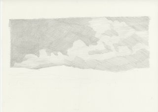
I have laid in the sky and have started working on the shingles and sides of the barn.


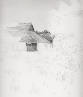
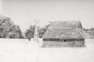
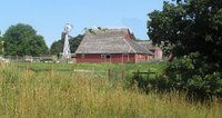
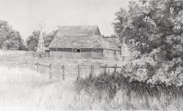
Continuing with the Living History Farm Series, I have started a drawing of the 1900 Barn. This is a 'classic' DWright composition. I had to do some adjusting of the image by merging a couple of photos together. But you'll get a good idea of what it will look like from this reference photo.
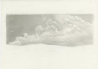