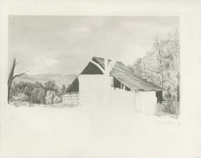
Here is the completed drawing cropped, adjusted and changed to grayscale.
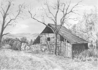
There is a slight tractor path where the grass is crushed. I used this to help lead the eye into the distance.
And before I knew it, the drawing was complete.
I hope this all helps you in your drawing endeavors!!
I am working on a number of things in this phase. I have sketched in the rest of the tree branches. Again, I am very careful where I place the branches and making sure I keep the viewer’s eye in the frame by bending the branches gracefully down.
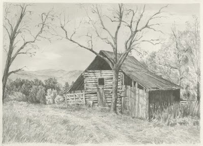
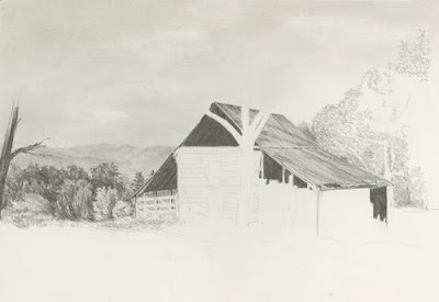
The barn has these beautiful logs for the boards in the center section – I don’t know if I captured them very well, but the texture seems right. I also danced a few tree shadows across the front of the barn which adds a lot the scene and allows me to keep those logs a bit bleached out.
I continue to work on the shorter grass in front of the barn.
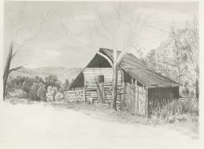
This is #7. My left-handedness took over and I’m working right to left again. I worked from the background trees forward into the overgrown grass and weeds. It looks like the tree is actually in front of the fence, but I pushed it behind and kept it less distinct. The weeds and grass are difficult for me to describe how they show up on the page. I just start drawing long and short pencil strokes. I then use my battery operated eraser and go over them – creating layers of grass, then I shade in-between the blades to create depth. I have multiple layers of this process until they look okay.
I am very observant on the direction the weeds point. I don’t want them leaning out of the frame as that will lead the viewer’s eye out the picture. I really use the weeds and grass to lead the viewer’s eye through the drawing.
I worked the shadowed side of the barn in at the same time as the grass. I actually did the barn first and then used my battery eraser to create thin strips of grass. I use sandpaper to shape the tip of the eraser to a point. After I have them laid in, I draw back in the dark areas to thin and shape the grass.
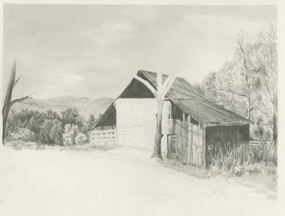
I have built a bit more depth to the foliage on the right. I have added some tree branches and shaded areas at the base of the trees. I also darkened the corner of the barn roof to give more contrast between the roof and the trees.
I have also toned down my foliage on the left using a chisel point clutch pencil – H. I also gave highlights to the orange tree and a bit more shading – to give it more roundness.
Continuing on….I have shaded in the darkest areas in the barn. If you lighten the reference photo or look very closely, you can see the rafters inside. I always try and give a hint of something inside the barn. This adds interest and intrigues the viewer to explore the shadows and use their imagination of what they see.
The roof of the barn was created using a clutch pencil with a chisel point. The hardness of the lead was H. I used long strokes of the pencil making sure I followed the slope & angle of the roof line. I also added the tree shadows on the roof. Be careful to not draw the shadows with angled pencil strokes. The shadow needs to lay on top of the barn. The pencil strokes therefore have to be in the same direction as the barn roof.
I have started to lay in the tree behind the barn. I am getting the first layer down with little depth. It is more to get the texture and shape of the area.
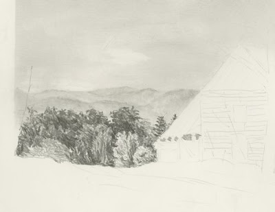
I have decided to cut the picture frame down some. I should have done this before I started. If you look at the image the barn is almost centered in the frame. If I remove about 2-1/2 “ of foliage on the right, this will move the barn over to the right, making the composition more pleasing. Also I will pull the bottom of the frame up and not draw as much grass. I like my drawings with a tight composition. I consider the extra foliage on the right and the grass on the bottom unnecessary ‘stuff’. It doesn’t add to the picture, so I remove it. I have cropped this image so you can see my new size. I will erase the extra sky before my next scan.
I am really enjoying this drawing. I am purposely keeping everything loose and attempting not to overwork any section.
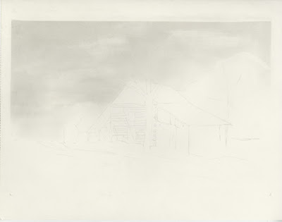
WIP 5
I have roughly laid in the trees (the dense foliage). Because of the distance it is from the barn – there really isn’t much detail to them. Concentrate on the shadows, work dark to light. I like to put in the detail tips of the trees first and then work my way down the trees. I use negative drawing to put the dark shadows behind the lighter trees.
I might come back and soften some of the rougher pencil lines, but I wanted you to get the feeling of how I ‘scribble’ in these forms.
I used a F lead .5mm mechanical pencil using my underhand grip to draw these.
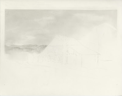
Wip 4 and detail
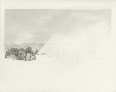
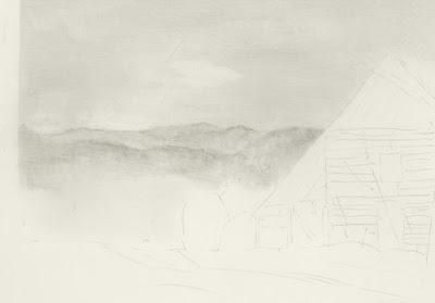
I have lightened the sky where the mountain range and sky meet. I used a tortillon to smudge in the distant mountain ranges. I have a tendency to put in too much detail in the distance – so I’m purposely keeping this very vague.
Here is Wip 3 and a detail of the distance mountain.
This project is a joint effort by Rick Chancey and myself. I have been working with Rick over the past few months giving him pointers on drawing. Rick discovered this beautiful reference photo taken by John Hirt
http://outdoors.webshots.com/photo/2320563120083311768NLCRQF. John has graciously given Rick permission to draw this scene and use it for our project.
Rick and I have decided to draw this scene together. Rick has encouraged me to post my wips and step-by-step process to assist others as well.
The paper is 11x14 300 Series Strathmore Bristol smooth. I printed the image off in a 4x6 photo paper and I also printed a copy 11x14 in grayscale. By printing off a copy the same size as the drawing image, I don’t have to work so hard enlarging the image. The grayscale also helps me get my values closer. I will actually set my drawing next to the grayscale image for comparison. I did save some time by using a light box to draw the building. While I definitely can draw the barn freehand, I save hours of time by lightly drawing the outline of the barn.
The barn in this image is placed well, so it lends itself to a straight transfer. You always want to make sure the vertical lines of the building are 90 degrees to the paper. Once I have the outline in place, I turn my paper upside down and lightly crosshatch the sky area. You can see I was fairly heavy handed in my crosshatching. I used a HB .7 mm mechanical pencil. If I really wanted a smooth sky, I would have used several more layers using a F hardness. But this sky has clouds and trees that are covering a large portion of the sky area, I’ve chosen to keep it fairly rough. I use a chamois to blend the cross-hatching smooth. I use an F hardness in a couple of layers to help smooth out some of the rougher areas. Then I use a t-square ruler and erase the over-blending from the edges. You can see that I have blended over the trees and the background mountain range. I’ve used a white eraser to lift out the clouds. I’ve smoothed them out with a chamois. As I work on the foreground, I will typically fiddle with the sky to smooth it more and define the clouds if needed. That’s it for Wip 1 and 2. Now I am going to work on the background mountain range and I will keep you posted!
Wip 2
Wip 1


