Saturday, August 21, 2010

Silver Reflections

As with any new tool, you need to explore just what you can do with it  and new pencils are no different.  So I pushed from the lightest to darkest using only two of the grades, 2B and 2H, of the Palomino Pencils.  The sky is done using a light layer of 2B chamoised smooth, with subtle changes to reflect the clouds hovering on top of the mountain peak.  The distant mountain texture is taking advantage of the 2B graphite grain on the paper  (300 Series Strathmore Bristol Board smooth).  The 2B is continued to be used to create the mid and foreground trees.

The water is created using the 2H.  The harder lead lends itself well to create the glass smooth stillness of the lake.  Using horizontal strokes, the gentle and subtle reflections are drawn in. 

Silver Reflections 
4-1/2 x 7- 3/4

This is from a reference photo taken by my nephew, Kyle Clark, during a recent mountain bike trip to Mt. Shasta in California.

Saturday, August 14, 2010

Palomino Pencils

Joey Centanni of Pencils.com requested that I try out some of their premier Palomino pencils. I kind of chuckled because if there is one thing I don't use is wooden pencils. But since they are featuring my artwork on their website, I thought the least I could do is to see if I liked their product.

I am pleasantly surprised and very impressed by the wonderful graphite quality of these pencils! They are encased in high quality cedar wood and the graphite is as smooth as silk.  The lead grades range from 2H, H, HB, B and 2B.  But don't let that fool you!  The 2H is comparable to an HB and the 2B is more like a 4B without the graininess!!

I'm an avid mechanical pencil user so I didn't think it was possible, but the Palomino just might make a convert out of me!  Here is my first drawing using these pencils.....but I guarantee it won't be my last.

Gentle Cascades

Saturday, July 17, 2010

Mike Sibley Workshops

I've been working this morning on the underside of the tree and grass using techniques that I learned during Mike Sibley's drawing workshop in Indiana.

It's been almost a year since the workshop and the improvement on my artwork has been incredible. And the revelations of "ah-ha"! are still happening!

To attend one of Mike's drawing workshops is an opportunity that any graphite artist should not miss. It doesn't matter what your subject matter preference is or your drawing style (from realism, sketches or abstract) the concepts and techniques Mike demonstrates can be applied to. Spending three days with one-to-one attention with a master is an experience that I will never forget.

Mike is coming back to the United States in September to conduct 4 more workshops! Visit his website http://www.sibleyfineart.com/ for workshop locations and information.

Here's the section of my current drawing. I've been pushing the branches on the underside of the tree back into the shadows. Using negative drawing techniques, I'm able to create the blackest areas between the leaves, allowing them to subtly appear deep in the shadows.


Friday, July 02, 2010

Barn...continued

Here's the next installment.....


The barn is slowly taking shape....working on balancing the foreground tree with the barn. The barn is tucked in between the trees.

Sunday, June 27, 2010

Misty Morning over Shaver Lake


Here's a quick rendering from a photo taken by my friend Peggy Allsman. Her son spent a scout weekend at Shaver Lake in California. It's a small drawing just 4x8"

Saturday, June 26, 2010

Wisconsin Barn

It's been almost a year since my last barn drawing, so I'd say it's about time for a scene closer to home. Just on the east side of the Mississippi, Wisconsin landscape displays beauty at every turn. This barn is tucked between trees with a vista that spreads out behind.


After playing with a number of different composition possibilities, I've got decided to get started and see where the pencil leads me. Here are the steps I've done so far. The size of the drawing is 10x18 on Mellotex paper stock. It's a relatively new paper for me and is ultra smooth.


The sky is created through a series of cross-hatching and chamoised smooth. I started with a F .5mm mechanical pencil and cross-hatched 3 layers of light, smooth pencil strokes. Then using a chamois to smooth the layer out. 3 layers of 2B cross-hatching, chamoised smooth with a final 2 layers of 2H cross-hatch applied with a light chamois blending to finish a smooth silver-toned sky. I have lightly blu-tacked the clouds. These will be developed as the rest of the drawing develops.


The trees behind the barn are starting to be formed. I start at the tips of the trees and work my way to the dense centers. I keep the leaves loose and open at the tips, allowing much of the sky to peak through. The open areas are as important as the leaf bundle placements. This gives way to the character of the tree. A 4B chisel point clutch pencil allows me to 'paint' the layers of leaves into the trees.


Saturday, May 22, 2010

Shadow Lake Outlet

With some assistance from a wonderful artist friend, Vince Whitehead, I tweaked a couple of areas and really brought depth to the drawing. Added darker trees to the lake edge and added some highlights to the water, and lightened the mountain as it touches the sky. Vince is a talented pen & ink artist, http://www.rural-route-one.com/, and we share a common interest in rural landscapes.


Strong pencil strokes and and negative drawing carries this drawing to completion. Keeping the entire composition loose with minimum detail helps to emphasize movement and energy.


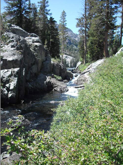
This is another from the Yosemite series. I started this drawing a bit differently than usual as I wanted to block in the foreground rock bluff on the left. (Since I'm a lefty, I typically start in the background and work my way right to left).

I then roughly sketched in the trees behind the rocks. These will get much darker as I work my way through the scene. I'm not getting too detailed as this is more an exploration of composition of light and shadows..... but then isn't that true for any drawing?

Whenever you are using reference photos, try various crops. The brush in the foreground is too dominant. By just cropping a bit of the right and bottom off, the central focus of the scene pops out.