Sunday, November 25, 2012

New Animal Sketches


I've been working on a sketch series for a new Royal Brush project.  These are some of the finished images for an "Animal Safari Adventure" Sketch & Learn book.  I really like the idea of combining interesting animal facts with the sketches and outlines.  


I've been learning a lot by drawing a variety of animals.  I've discovered you don't have to include every bit of detail, but rather strike a balance of giving just enough information to "read" a feature.  For example, I did not include every spot on the cheetah, but rather gave the impression of spots.  And I don't even attempt to draw every hair, but just enough to look like fur.  Detail and sharpness around the eyes is especially importance as that is typically the focal point with animals.  


Palomino Colored Pencils

This is a quick study using the brand Palomino Colored Pencils.  I love the Palomino graphite pencils and just had to give the colored ones a try.  They only come in a total of 24 colors, but since I tend to use a limited palette, these are plenty.  I am pleased with the color intensity as well as the quality.  No crumbling, no breakage of the lead.  These are available for purchase at www.pencils.com

Thursday, November 01, 2012

Artwork Featured in New Drawing Book


I have just received a copy of a new book called Drawing & Sketching Secrets that features several of my drawings.  The book was written by Donna Krizek.  It is an honor to have my artwork in the same book as other very talented artists such as Karen Hargett, Mike Sibley, Terry Miller, David Te, David Poxon to name just a few.   

Here is a direct link to Amazon to purchase this book (ISBN 978-1-60652-489-3).  
(Note: The cover image is incorrect on the link, but this is the same book.


Monday, October 08, 2012

Article Two - It All Starts with a Mark

Repost from http://pencils.com/blog/it-all-starts-with-a-mark/


The anticipation of making that first mark on a blank sheet of paper for me is exciting.  Each mark builds upon the last one and soon the image begins to evolve and appear on the paper.

As with any art medium, knowing what your graphite pencil can do is important.  The simple pencil can make a variety of different textures and effects just with a little practice.

Smooth Gradient
Creating a smooth tone from dark to light.  Practice creating a smooth gradient by using heavier to lighter pencil pressure in one pass.  Notice the difference between using a harder lead versus a softer lead. The softer lead creates a darker more grainy tone.

 Gray Scales  
Use the full-range of pencils available (6B – 2H) to match the value.  You can vary your pencil pressure and/or use multiple pencil grades to create the value.  Be sure to note which pencil(s) were used for future reference.
Pencil Marks
Varying the pencil mark can create a multitude of different effects. Combining different pencil marks in one sketch, will create variety, and more realistic images.
  • Circular – Draw small circular strokes using a light pressure.  Use multiple layers to create a smooth, even and diffuse tone.   Particularly effective for skin textures.

  • Cross hatching – Draw close parallel lines.  Change the rotation of the lines with each layer.  This works well for large areas and creates a smooth, ‘linen’ effect.

    Scribbling – Using the over-hand pencil grip, create small random scribbles.  This is very effective in creating foliage on trees.
  • Random marks – This is similar to scribbling, except the marks are random.  Varying the pressure of the pencil can build up areas quickly.  This is a great technique when exploring subject matter and quick sketching.


Erasing
Erasing can be as important of a tool as the pencil.  By removing or lifting off graphite from your sketch, you not only remove mistakes, but can also create different effects and subtle values.
  • Kneadable eraser – This eraser can be molded into shapes and lift graphite off the paper.  To clean the eraser, just knead until the graphite is absorbed into the eraser.
TIP: Remove graphite from your sketch. As long as the graphite has not been marred into the tooth of the paper, you can actually remove all graphite from your sketch by using a “press and lift” approach. Practice this technique and you will never have to worry about making a mistake or going too dark again!


  • White Mars eraser – I use this eraser sparingly.  Most common use is to erase using a ruler to create sharp edges. I keep a sharp edge on the eraser by slicing at an angle with a knife.


TIP:  DO NOT USE the white eraser on dark areas.  This will smudge the graphite and push the graphite into the fibers of the paper, making it difficult or impossible to remove.  INSTEAD, use the kneadable eraser to lift the graphite off the paper first, then finish with the white eraser.


Blending
Blending pushes the graphite into the fibers of the paper and removes the “graininess” of graphite layers.  This creates a very smooth, soft affect that is commonly used to create clouds in landscapes and smooth skin in portraits.
  • Blending Stump – The stump made from pressed paper.  This is used to blend small, detail areas on your sketch.
  • Chamois – The chamois is a soft material that you wrap around your index finger, then using a circular motion, rub to blend the graphite layers to a smooth finish.  This works well for larger areas such as creating skies in landscapes, or backgrounds.

Burnishing
Burnishing is a technique of applying a harder lead (3H) with the flat part of a chisel point over a detailed area.

  • Blending versus Burnishing – The purpose of both blending and burnishing is to create a unified even value over a specific area but each will create much different results.  Blending will blur or lessen your detailed areas, creating a softer look. Burnishing will retain all the under lying detail while creating a light unified tone.  Burnishing will create a more realistic image than blending.


Q and A  – Each article will be posted on Diane’s blog at www.dwrightart.blogspot.com.  Comments or questions can be posted there and Diane will respond to any questions or discussions


Sunday, September 30, 2012

Fall Colors 2012


Due to our early spring and super-dry summer, fall has come early this year.  Today was a beautiful day to enjoy the explosion of colors.  Ledges State Park was recently re-opened after the floods of 2008, so we decided to check it out.  Lots of folks were enjoying the mild weather and the beautiful fall colors.  Yup, this is proof that Iowa is more than just corn fields.


One of my personal favorites.  My husband is peeking out behind the tree.  Love it!


Ledges is known for is soft sandstone bluffs.  The trees grow on top of the rocky formations.


We seldom see these brilliant oranges and deep reds.....


 One the way home, I caught a couple of scenes with the brilliant yellows.  The dark reds are sumac.


Sunday, September 23, 2012

Grand Canyon

I love vacations.  They don't come often enough.  After spending several weeks of working overtime at the day-job, having a few days off can rejuvenate the soul.  We enjoy going to Las Vegas as there is always something to do (without even gambling).

This visit, we added a day trip to the Grand Canyon.  The beauty of the canyon is so spectacular, words cannot describe it and photos can't capture the sheer vastness of the vistas.  But here are a few of my best attempts...(click on the image to enlarge)


Tuesday, September 04, 2012

Article One - Pencil Basics

Repost from http://pencils.com/blog/pencil-basics-with-diane-wright/

Greetings Studio 602ers! Over the next few weeks, Pencils.com featured artist Diane Wright will be sharing several articles that cover the basics of creating art with a pencil . If you aren’t familiar with Diane or her work, check out this interview featuring the Queen of Landscape Pencil Art herself and, without further ado, let’s get started!


 A Passion for Drawing

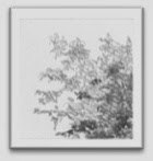
I am frequently asked, “Why drawing?” Pencil art is one of the most direct and expressive art forms. It is also the most simple, requiring just a piece of paper and pencil. The pencil is an extension of the hand and the flow of ideas onto the paper becomes seamless.

The process of drawing can help us explore our ideas and capture the wealth of detail from the world around us. Our creations can be as simple as a partial sketch or as complex as a finished piece of art. It’s amazing what can be expressed with just a pencil.
Over the next few weeks, we are going to discuss the some of the basics of drawing to help you get started.
Let’s start with the basics….

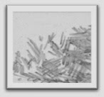
Pencil lead hardness – Pencil hardness ranges from 9H to 9B, with 9H being the hardest and 9B the softest. Their characteristics differ in that the H’s create a lighter mark that produces a light silver color while the B’s are softer, creating a darker and blacker mark. Do you really need all of them? It is nice to have the full range, as each one is subtly different, but as you work 2 or 3 will become your favorites.

Pencil point – The point on you pencil has a large effect on the type of pencil mark you will produce.

A sharp point is used to make fine lines and work in small detail areas.A blunt or rounded tip will produce less refined marks and is good for shading. The chisel point is the most versatile. The flat side is good for shading and the edge can be used for creating detail or fine lines.
Pencil grip – How you hold your pencil can affect your pencil strokes.

The writing grip (the one that you use to write with) is good when working in detail areas. It creates a very deliberate stroke and precise details. If your marks are too tight, you are probably holding the pencil too tight.
The underhand grip creates a smooth, flowing stroke. Hold your palm above and almost parallel to the drawing surface with the pencil running under and across the palm. (I rest the butt of the pencil on my little finger.) Keeping your wrist stiff, use your entire arm to make the stroke. This allows a more fluid motion resulting in a fluid mark. With a little practice, this grip becomes very comfortable and natural.

Pencil pressure – This is simple: the harder you press down on the paper with the pencil, the stronger and darker the mark and the lighter the pressure, the lighter the mark. As I explore a subject, I will use more pressure when I am drawing the shadow and use lighter pressure when working in the highlights. I feel those lights and darks with the amount of pressure I apply to my pencil. This creates very expressive lines and in turn, brings life to your mark.
Paper – Choosing the right paper is important; your efforts are worth using good quality paper. My preference is Bristol board smooth drawing paper (two great brands include Strathmore 300 Series Bristol board smooth and Canson Foundation). For portraits, I prefer Arches or Fabriano hot press watercolor paper.
Questions? – Each article will be posted on Diane’s blog. Comments or questions can be posted here at Studio 602 or on Diane’s blog, where Diane can respond directly.

Next Article: It all starts with a mark