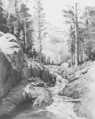
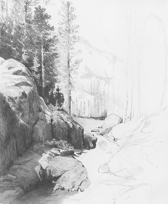
Strong pencil strokes and and negative drawing carries this drawing to completion. Keeping the entire composition loose with minimum detail helps to emphasize movement and energy.
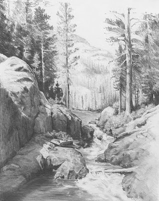
This is another from the Yosemite series. I started this drawing a bit differently than usual as I wanted to block in the foreground rock bluff on the left. (Since I'm a lefty, I typically start in the background and work my way right to left).
I then roughly sketched in the trees behind the rocks. These will get much darker as I work my way through the scene. I'm not getting too detailed as this is more an exploration of composition of light and shadows..... but then isn't that true for any drawing?
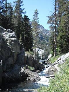
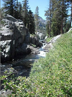
Whenever you are using reference photos, try various crops. The brush in the foreground is too dominant. By just cropping a bit of the right and bottom off, the central focus of the scene pops out.
