Sunday, November 30, 2008

Season's Greetings


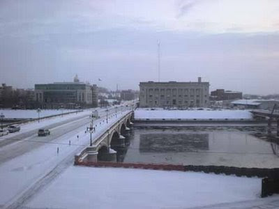
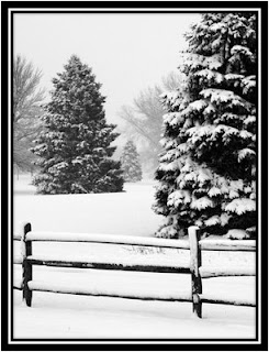
This morning we woke up to a snow winterland. Just enough snow to cover the trees. My husband asked if I wanted to go out and take photos, so I jumped at the opportunity! The roads were slick and a gal had run off the road. My husband stopped to see if she needed assistance and she was fine. As he was helping her, this was the view out my window.

So what a great story to start the holiday season and a great way to wish you all a Very Merry Holiday Season!

Diane

Saturday, November 29, 2008

Sea Creatures

Here are a set of 6 sea creatures that are being submitted for another project at Royal Brush Company. These are for sketch kits for 3-5th grade level junior artists.


Royal Brush Commission

Over the past few weeks I have been working on a series of drawings for Royal Brush company. These images are going to be used 8 x 10" sketch kits. The age level is teenage to young adult.


Sunday, October 05, 2008

Church of the Land - Living History Farms

"The Church of the Land stands as a tribute to the idea that people of different religious faiths can live together peacefully.
The Church of the Land in Walnut Hill was built in the carpenter gothic style. The narrow points at the top of the windows, the ends of the pews, and the pulpit imitate the gothic cathedrals of Europe. During the 1870s, it was popular to mix different kinds of woods in the same room. At the Church of the Land, the ceiling is made from hemlock, the dark beams are cedar, and the pews and altar are red elm. The doors, window sashes, windowsills, and baseboards are pine, while the floor is fir.
The Church stands on the same hillside where Pope John Paul II spoke to an estimated 350,000 people on October 4, 1979. " (for more information, visit www.lhf.org)
This drawing will be available as open edition prints and notecards.

Monday, September 29, 2008

Fiber Artist - New Website


I am so excited to share this new website!

Doris Deutmeyer is an extremely talented artist who creates beautiful artwork by using fabric. Visit her website today and email her to welcome her into the international world through the internet!

Saturday, August 09, 2008

2-1/2 Moos and 2 Barns

The grass was really bugging me...so I chopped it all up. Instead of creating long wispy grass, I figured short choppy stuff might be better. It's looking better, but still needs some work.

Here is an update on the barns. I think I'm almost done. I've really attempted to develop strong tonal values through out the scene. I think it's working to bring everything together. Now if I can just figure out the clumpy grass and rough ground...it's just not quite right yet.

Well, the cows are in place. It seemed that I was losing the spacial depth between the two barns, so I have sketched in some fence. Hopefully this will put some distance between the two barns and put the cows in better perspective.I have more details to put on the barns and the roof needs to be shingled yet. The grass needs to be clumpy and the ground roughened up. I'm pushing the darks further as well.
Step one - Working on the the barn on the right and the shingles....

Moo.....

The original photo: The cropped version:
The cows....
Sunday, June 22, 2008

Home Portrait Continued

July 13, 2008

Well, I think for the most part this portrait is completed. I've added the driveway rock center, added shadows from the trees across the driveway and planted the hostas and grass in the foreground.
The foreground tree has been quite a challenge. It has enough detail to add interest to the portrait but I've had to be careful that it doesn't steal the show. I have a bit of gardening to do to plant some hostas around the roots and the driveway is left to do. Getting closer!

I've started working on the foreground tree here. The leaves are canopied to lead the eye to the house.


Here is an update to my current drawing. it's been slow developing but I really want to capture the wonderful details of this home. Springtime was a perfect time to take a photo as it allowed more open skies and the background trees are delicately placed in with light rendering.


Saturday, June 14, 2008

The Many Faces of a Bridge

This is the view from my office. The Des Moines River has made national and international news this week for showing it's angry side. Over the past 11 years, I have seen the many personalities of this river and the bridge. The flood picture is from my window just yesterday morning…during the last trip in the building before they closed the area.

Here are just a few of the many faces of the Court Avenue Bridge and the Des Moines River…


Iowa Flooding

I have had a number of folks asking how I am faring through the Iowa flooding. I want to thank everyone for their checking up on me!

I am fine and my home is dry. However, my office building has made national news. It is located at 100 Court Avenue right next to the Des Moines River. It flooded on Wednesday evening, flooding out the Buzzard Billies Restaurant in the basement and destroying the power supply for the building. I have spent the past two days carrying servers, computers and printers out of the building and relocating to a temporary office space.

Here is an image from my office window just yesterday morning during my last trip in before they closed the area for evacuation....doesn't that look scary!? Just a few feet left before it goes over....


Sunday, June 01, 2008

Home Portrait II

The landscaping really accentuates this house. Unique bushes decorate the front of the home.

After a slow start, I finally got into a rhythm of drawing the stones. Once I figured that out, the house has started to immerge on the paper.

The first step is to create a light outline of the structure and details. Placement and proportions are determined at this point. I then shade in the tone of the sky. This allows the white of the paper to be used only for the highlights.

I have been commissioned to draw another home portrait. This one is in Beaverdale and is a beautiful stone house. It has a lot of features that remind me of Frank Lloyd Wright designs.

Saturday, May 10, 2008

Home Portrait - Commission

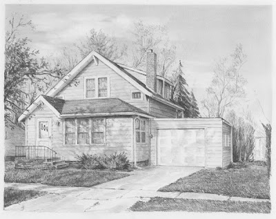
Well, looks like I've almost got this one completed. I've just got a few minor touch-ups. ....


I'm continuing to work on the trees behind the house. Just one more foreground tree on the right sweeping over the garage and it should be close to being completed.


I've added the foreground tree on the left....just a bit of overlap on the house to give some understanding to the tree reflections on the house. I've got a bit more shaping to do on the leaves and branches but it's almost there. Then it's the foliage at the back of the garage to frame the house nicely....


I've almost completed the house.;.. I need to do some adjusting of the tree reflection values but I'm going to wait until I finish the grass and trees.


With the bushes completed in the front and just a hint of the pattern on the garage door, the portrait is starting to come together. I'm saving the best for last...the trees, foliage and grass!


This view was taken in the early evening. This allowed some beautiful tree shadows to play across the front of the house. I don't want to draw too much attention to them but they will certainly add interest this portrait.


More of the house is completed and I'm just starting to add the trees in the background. Since this is a newer architecture, the corners and trim need to be more crisp and true. But it's coming along nicely.


I'm starting at the top of the house and working my way down.


I start the drawing with the house framed in - care is taken to make sure all the angles and perspective are 'just' right. Then I shade in the sky and lift off areas for the clouds.


This is the reference photo for a commissioned work. Paul is getting married at the end of June and as a wedding gift he requested a graphite home portrait be created of his fiance's house. It is a simple 1-1/2 story home, but it has so much charm. What a unique gift to his bride.


Monday, March 24, 2008

Featured Artwork

Two new art instruction books have just been released by Quarto Publishing Company of London. Both of these books feature my artwork! For those of you who follow my artwork, you may even recognize the cover of the Landscape book - The Mitchellville Barn #2!

Each book features 3-4 of my artwork. If that isn't enough to convince you to purchase them, well each book holds lots of great information on how to draw Still Lifes and Landscapes.

The Still Life Sketching Bible by David Poxon
ISBN: 0-7858-2362-X


The Landscape Artist's Drawing Bible by Hazel Harrison
ISBN: 0-7858-2361-1


DIANE WRIGHT
Artwork Featured in two new books!


Sunday, March 16, 2008

Westwinds Ranch VA

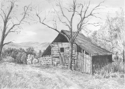
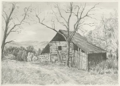
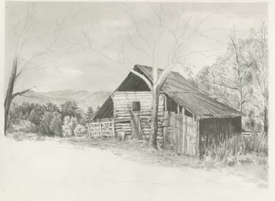
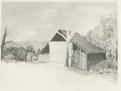
Here is the completed drawing cropped, adjusted and changed to grayscale.


There is a slight tractor path where the grass is crushed. I used this to help lead the eye into the distance.

And before I knew it, the drawing was complete.

I hope this all helps you in your drawing endeavors!!


I am working on a number of things in this phase. I have sketched in the rest of the tree branches. Again, I am very careful where I place the branches and making sure I keep the viewer’s eye in the frame by bending the branches gracefully down.

The barn has these beautiful logs for the boards in the center section – I don’t know if I captured them very well, but the texture seems right. I also danced a few tree shadows across the front of the barn which adds a lot the scene and allows me to keep those logs a bit bleached out.

I continue to work on the shorter grass in front of the barn.


This is #7. My left-handedness took over and I’m working right to left again. I worked from the background trees forward into the overgrown grass and weeds. It looks like the tree is actually in front of the fence, but I pushed it behind and kept it less distinct. The weeds and grass are difficult for me to describe how they show up on the page. I just start drawing long and short pencil strokes. I then use my battery operated eraser and go over them – creating layers of grass, then I shade in-between the blades to create depth. I have multiple layers of this process until they look okay.

I am very observant on the direction the weeds point. I don’t want them leaning out of the frame as that will lead the viewer’s eye out the picture. I really use the weeds and grass to lead the viewer’s eye through the drawing.

I worked the shadowed side of the barn in at the same time as the grass. I actually did the barn first and then used my battery eraser to create thin strips of grass. I use sandpaper to shape the tip of the eraser to a point. After I have them laid in, I draw back in the dark areas to thin and shape the grass.


I have built a bit more depth to the foliage on the right. I have added some tree branches and shaded areas at the base of the trees. I also darkened the corner of the barn roof to give more contrast between the roof and the trees.

I have also toned down my foliage on the left using a chisel point clutch pencil – H. I also gave highlights to the orange tree and a bit more shading – to give it more roundness.


Continuing on….I have shaded in the darkest areas in the barn. If you lighten the reference photo or look very closely, you can see the rafters inside. I always try and give a hint of something inside the barn. This adds interest and intrigues the viewer to explore the shadows and use their imagination of what they see.

The roof of the barn was created using a clutch pencil with a chisel point. The hardness of the lead was H. I used long strokes of the pencil making sure I followed the slope & angle of the roof line. I also added the tree shadows on the roof. Be careful to not draw the shadows with angled pencil strokes. The shadow needs to lay on top of the barn. The pencil strokes therefore have to be in the same direction as the barn roof.

I have started to lay in the tree behind the barn. I am getting the first layer down with little depth. It is more to get the texture and shape of the area.

I have decided to cut the picture frame down some. I should have done this before I started. If you look at the image the barn is almost centered in the frame. If I remove about 2-1/2 “ of foliage on the right, this will move the barn over to the right, making the composition more pleasing. Also I will pull the bottom of the frame up and not draw as much grass. I like my drawings with a tight composition. I consider the extra foliage on the right and the grass on the bottom unnecessary ‘stuff’. It doesn’t add to the picture, so I remove it. I have cropped this image so you can see my new size. I will erase the extra sky before my next scan.

I am really enjoying this drawing. I am purposely keeping everything loose and attempting not to overwork any section.


WIP 5


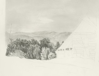
I have roughly laid in the trees (the dense foliage). Because of the distance it is from the barn – there really isn’t much detail to them. Concentrate on the shadows, work dark to light. I like to put in the detail tips of the trees first and then work my way down the trees. I use negative drawing to put the dark shadows behind the lighter trees.

I might come back and soften some of the rougher pencil lines, but I wanted you to get the feeling of how I ‘scribble’ in these forms.

I used a F lead .5mm mechanical pencil using my underhand grip to draw these.


Wip 4 and detail


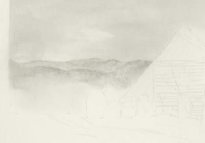
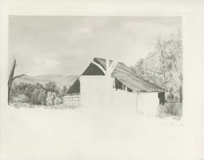
I have lightened the sky where the mountain range and sky meet. I used a tortillon to smudge in the distant mountain ranges. I have a tendency to put in too much detail in the distance – so I’m purposely keeping this very vague.

Here is Wip 3 and a detail of the distance mountain.


This project is a joint effort by Rick Chancey and myself. I have been working with Rick over the past few months giving him pointers on drawing. Rick discovered this beautiful reference photo taken by John Hirt http://outdoors.webshots.com/photo/2320563120083311768NLCRQF. John has graciously given Rick permission to draw this scene and use it for our project.

Rick and I have decided to draw this scene together. Rick has encouraged me to post my wips and step-by-step process to assist others as well.

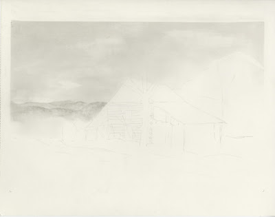
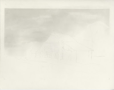
The paper is 11x14 300 Series Strathmore Bristol smooth. I printed the image off in a 4x6 photo paper and I also printed a copy 11x14 in grayscale. By printing off a copy the same size as the drawing image, I don’t have to work so hard enlarging the image. The grayscale also helps me get my values closer. I will actually set my drawing next to the grayscale image for comparison. I did save some time by using a light box to draw the building. While I definitely can draw the barn freehand, I save hours of time by lightly drawing the outline of the barn.

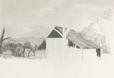
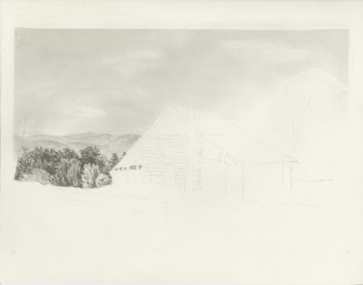
The barn in this image is placed well, so it lends itself to a straight transfer. You always want to make sure the vertical lines of the building are 90 degrees to the paper. Once I have the outline in place, I turn my paper upside down and lightly crosshatch the sky area. You can see I was fairly heavy handed in my crosshatching. I used a HB .7 mm mechanical pencil. If I really wanted a smooth sky, I would have used several more layers using a F hardness. But this sky has clouds and trees that are covering a large portion of the sky area, I’ve chosen to keep it fairly rough. I use a chamois to blend the cross-hatching smooth. I use an F hardness in a couple of layers to help smooth out some of the rougher areas. Then I use a t-square ruler and erase the over-blending from the edges. You can see that I have blended over the trees and the background mountain range. I’ve used a white eraser to lift out the clouds. I’ve smoothed them out with a chamois. As I work on the foreground, I will typically fiddle with the sky to smooth it more and define the clouds if needed. That’s it for Wip 1 and 2. Now I am going to work on the background mountain range and I will keep you posted!

Wip 2
Wip 1